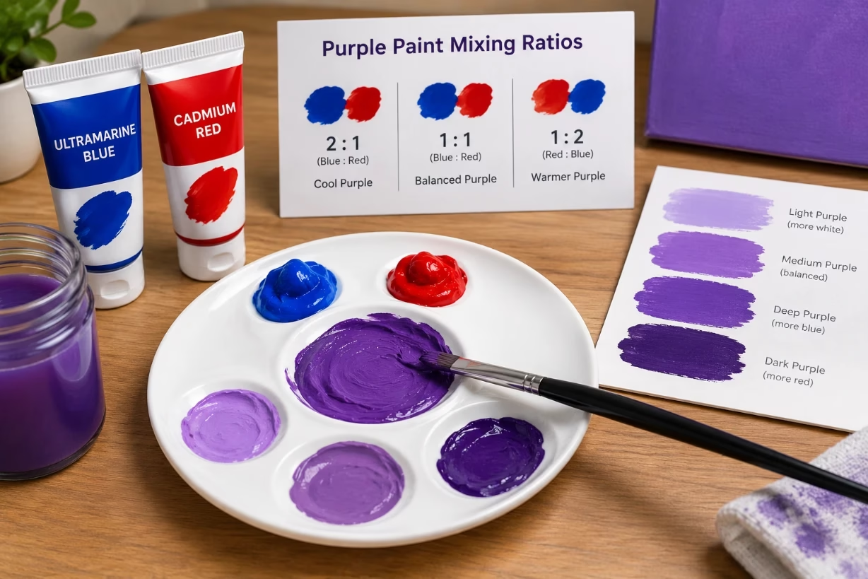
If you want to know how do you make color purple paint, the basic recipe is simple. Mix red and blue paint in roughly equal parts, then adjust the ratio. More red gives a warmer, magenta purple, and more blue gives a cooler, violet purple. From there, you fine tune with white, black, or a touch of yellow.
Why Mixing Purple Feels Tricky At First
When people ask how do you make color purple, they often expect one simple ratio that works every time. In real life, purple is a whole family of colors, not just one shade. The red you choose, the blue you choose, and even tiny drops of other colors change the final result.
I grew up thinking I could just mix “any red” with “any blue” and get a bright royal purple. Instead, I sometimes ended up with muddy grape or a dull brownish tone. That is usually not a failure in skill, but a side effect of how color pigments actually work.
Once you understand what is inside each tube of paint and how those pigments mix, you stop guessing. You start to control exactly which purple you get. That is what I want to walk you through here.
The Core Formula: Red Plus Blue To Make Purple
At its base, the answer to how do you make color purple is always this: purple is a secondary color, made by mixing red and blue, which are primary colors in traditional painting. But not all reds and blues are equal. Some lean slightly yellow or slightly green, and that changes the purple a lot.
Best Red And Blue Choices For Clean Purple
If you want a clear, bright purple with no mud, pick a red that leans toward pink and a blue that leans toward violet. In paint terms, that usually means:
- A cool red, like magenta, quinacridone red, or a rose color
- A cool blue, like ultramarine or phthalo blue (red shade)
When someone asks how do you make color purple without it turning brown, this is where I start. Use cool primaries that do not carry much yellow. Yellow mixed into purple pushes it toward gray or brown.
Simple Starting Ratio For Purple Paint
You do not need a perfect formula, but a starting point helps. For a standard middle purple suitable for flowers, skies, or fabrics, I often start with:
1 part cool red : 1 part cool blue
From that equal mix, I adjust toward the shade I want. More red means warmer, more blue means cooler. How do you make color purple richer? Add a touch more blue. How do you make color purple softer and lighter? Mix in white.
Warm vs Cool Purples: Controlling The Mood
Even children can see that some purples feel like magenta pink and others feel like a deep night sky. Those feelings come from the temperature of the color. When you work on how do you make color purple in art, knowing warm vs cool is key.
Warm Purple: More Red In The Mix
Warm purples are cozy, playful, and often appear in flowers, fashion, and fantasy art. To mix them, I use a ratio like:
2 parts cool red : 1 part cool blue
This gives a purple that leans toward magenta. If the question in your mind is how do you make color purple that looks romantic or floral, this warm ratio is what I suggest first.
Cool Purple: More Blue In The Mix
Cool purples feel calm, distant, and sometimes mysterious. Think twilight shadows or stormy skies. For cool purple, I mix:
1 part cool red : 2 parts cool blue
If someone asks how do you make color purple that looks like violet or indigo, I push the blue stronger and keep red as the support, not the star.
Why Some Purples Turn Muddy Or Brown
One of the most common problems is this: you mix red and blue, but instead of a clean purple, you get a dull, grayish color. That can be a shock if you are just learning how do you make color purple for painting.
The Hidden Yellow Problem
The main villain here is yellow hiding inside your red or blue. For example, a warm red like cadmium red leans toward orange, which means it already has yellow built in. A greenish blue like phthalo blue (green shade) has yellow influence too. When red (with yellow) meets blue (with yellow), all three primaries join up and move the mix toward brown.
To avoid this, I stay away from strong orange reds when I need pure purple. I also avoid blue that leans too green. When people ask how do you make color purple that looks clear, my advice is always “check the bias of your primary colors” first.
Fixing Muddy Purple
If your mix is already muddy, you can still rescue it. I usually try one of these:
- Add more of a clean cool red, like magenta, to pull it back toward purple.
- Add more clean cool blue, like ultramarine, to deepen and cool the mix.
- Add a bit of white to see the real undertone more clearly.
After a few tries, you will feel more confident each time you face how do you make color purple less muddy in future paintings.
Using White, Black, And Gray With Purple
Once you have a base purple, the next step is shaping it into tints, shades, and tones that match your subject. If you keep asking how do you make color purple work in shadows, highlights, and midtones, this is where the answers live.
Making Pastel Or Lavender Purples With White
Adding white to purple gives you softer, lighter versions often called lavender, lilac, or mauve. I usually start with:
1 part purple : 1 part white
Then I adjust. Double the white if you want a very pale, airy lilac. In interior painting and digital art, many people search how do you make color purple that suits bedrooms or kid-friendly spaces. The truth is simple: a generous amount of white turns intense purple into something gentle and peaceful.
Deep, Dramatic Purples With Black Or Dark Blue
Black can quickly dull purple, so I use it carefully. To make darker purple while keeping it rich, I often mix:
2 parts purple : 1 part ultramarine or dark blue
If I do use black, it is just a tiny touch at a time. Dark purple is often used for shadows in fabrics, night skies, or dramatic backgrounds. When learners ask how do you make color purple look deep but not dead, my answer usually involves dark blue rather than a heavy dose of black.
Soft, Dusty Purples With Gray Or Complementary Colors
Not every purple has to scream with intensity. Sometimes you need a gentle, muted purple for landscapes, skin shadows, or old stone. To mute purple, I either mix it with a tiny amount of yellow (its opposite on the color wheel) or add gray.
If your question is how do you make color purple that feels natural and earthy, not neon, this step helps a lot. Mix slowly, test often, and stop as soon as the purple feels calm instead of bright.
How Different Paint Types Affect Purple Mixing
The basic logic of how do you make color purple stays the same across paint types, but the feel and flow can change. Acrylic, oil, watercolor, gouache, and even digital painting all have little quirks.
Acrylic And Tempera Paint Purples
Acrylic dries fast and often a bit darker than it looks when wet. I usually mix my purple a little lighter than what I think I need. If I am teaching children how do you make color purple in class with tempera or student acrylics, I stay with strong cool red and cool blue and let them adjust by eye.
Oil Paint Purples
Oil paint mixes smoothly and stays workable for a long time. This helps when you need to blend large purple areas like skies or fabric folds. Because oil colors are strong, I often use very small amounts of blue when darkening purple. If someone asks how do you make color purple subtle in oil painting, I suggest soft layering and glazing instead of heavy mixing on the palette.
Watercolor And Gouache Purples
With watercolor, the paper and water do half the work. I mix a rich purple on the palette, then dilute it with more water on the paper to get lighter shades. Gouache works like an opaque cousin of watercolor, so you get solid, flat purple areas. In both, a tiny change in water level can change how do you make color purple appear on the page, so testing on scrap paper helps a lot.
Digital Painting Purples
On a screen, you are dealing with light, not pigment. You still combine red and blue, but you usually pick from a color picker. Many digital artists still face the same question how do you make color purple feel alive instead of flat. The answer is similar: push temperature, vary saturation, and do not rely on one single purple. Use slightly warmer purples near light and cooler purples in shadow.
Real-Life Ratios For Common Purple Shades
Words like “warm” and “cool” help, but concrete mixes are easier to follow. When someone asks how do you make color purple for specific uses, I often give these as starting recipes. All of these assume you are using a cool red and cool blue.
Medium Royal Purple
Ratio: 1 part red, 1 part blue
This mix is strong and balanced. It works for school projects, logos, and any time you want the classic “purple” people think of. If a student asks how do you make color purple that looks like a standard crayon shade, this is it.
Lavender Or Lilac Purple
Ratio: 1 part purple, 2 to 3 parts white
Start from your royal purple, then slowly add white. The more white, the more it slides from mid purple toward pale lavender. If you have ever wondered how do you make color purple like spring flowers or pastel designs, this white-heavy ratio is exactly where you want to explore.
Deep Eggplant Or Plum Purple
Ratio: 2 parts purple, 1 part ultramarine blue, tiny touch of black (optional)
This gives a dark, rich purple that suits shadows, evening scenes, and dramatic clothing in paintings. When someone writes asking how do you make color purple close to eggplant, I tell them to build up slowly with extra blue first, then decide if a tiny dash of black is really needed.
Muted Dusty Mauve
Ratio: 2 parts purple, 1 part white, tiny touch of yellow or gray
This mix is lovely for old stone, vintage clothing, or gentle skies. The tiny bit of yellow or gray pulls the purple back from bright and makes it more natural. How do you make color purple look calm and grown up? Aim for mauve or dusty purple instead of bright neon.
Using Purple In Design, Art, And Daily Life
Knowing how do you make color purple is useful beyond the palette. Purple carries strong meaning in culture and design. It often signals creativity, mystery, royalty, spirituality, or fantasy. The exact shade you choose changes that feeling.
A soft lavender wall feels calm and cozy, while a sharp neon purple sign feels loud and modern. A dark plum dress feels formal and rich. When you ask how do you make color purple match your project, you are really asking what emotion or mood you want people to feel.
In painting, purple is a great color for shadows because it already holds both red and blue. When I paint skin tones, a thin wash of muted purple in the shadows can make the figure feel more alive. For landscapes, purple shows up in distant mountains, shaded snow, and late sunset clouds. The more you practice, the more you will notice purple hiding in places you did not see before.
Practice Plan: Training Your Eye For Purple
Reading about how do you make color purple helps, but your hands and eyes learn the lesson better than your brain alone. I like a simple practice that you can do with just two primary colors and white.
Step 1: Make A Purple Gradient Strip
On a piece of paper or canvas, paint a pure blue patch on the left and a pure red patch on the right. Then, between them, mix small piles of paint, each one with a different red-to-blue ratio. Lay them out in order, so you can see the change from blue, through many purples, into red.
As you do this, keep asking yourself how do you make color purple warmer or cooler, and watch what happens when you tip the mix one way or the other.
Step 2: Add White Rows
Below that gradient, take each purple mix and add white to create a lighter version. Paint that under the original. You will end up with lines of lavender, lilac, and pale violet, all connected to your base row.
This is a powerful visual answer to how do you make color purple in many values, from dark to light. It becomes your own homemade color chart.
Step 3: Note Favorite Ratios
As you test, write small notes under your favorite swatches. You might write “2R:1B + white” or “1R:2B + touch yellow” for mixes you want to repeat later. Over time, you build your own language of purple that no book or video can fully replace.
Common Mistakes Beginners Make With Purple
I see the same patterns over and over when people explore how do you make color purple for the first time. The problems are simple, and so are the fixes.
First, many start with the wrong red and blue. They grab any red, any blue, and get mud. Fix this by choosing cool, clean primaries when you want a clear purple.
Second, they add white or black too fast. Purple is strong, and black especially can kill it. Fix this by using tiny amounts and testing on the edge of your palette or scrap paper.
Third, they expect one universal recipe. Color, especially purple, depends on light, surface, and context. Fix this by treating how do you make color purple as a flexible idea, not as one strict formula.
Bringing It All Together
If you have read this far, you can probably answer someone else when they ask how do you make color purple. You know it starts with red and blue, but you also know the deeper story. The kind of red matters. The kind of blue matters. The ratios and added white, black, yellow, or gray matter.
Most of all, the shade of purple you choose should match the feeling you want. Soft lavender for peace, bright violet for energy, deep plum for drama. Once you see purple as a whole family of colors you can shape, you stop fearing the question how do you make color purple and start enjoying the play of mixing it.